Wednesday 28 October 2009

Hoefler and Frere-Jones

http://www.typography.com/home/index.php?affiliateID=

H&FJ only focus on typography and consists of more traditionally structured type designers. Like Hunter, H&FJ have worked with The Guardian and also design decorative font, but more with the idea that it will be used as full working font for any format. By looking at their fonts you can see how much research and development has gone into the process of designing. They are continuously developing original fonts resulting in nearly 1000 designs, taking into consideration culture, history and their clients. The typefaces are legible and designed for custom to big clients or the public. H&FJ’s website is well designed and professional like their fonts.


H&FJ use typography to show what their clients are about and to voice their identity. With clients having their own typeface designed specifically for them, this means they manage to stay original and unique, allowing them to have personality that their intended audience want to be involved with. They have a massive client list ranging from areas in retail to entertainment. Their biggest client lists are newspapers and magazines such as The New York Times and Vanity Fair.

The font Tungsten is a strong and powerful font whilst also being compact. It would be a great font to have used when doing my poster to represent Jordan aka Katie Price. Like Jordan, Tungsten is tough and confident and reminds me of a powerful tabloid type, which would fit perfectly with Jordan who is constantly in the newspapers.


I also love Requiem Fine Small Caps. The reason for this is the flow of the serifs and font as a whole, giving it the grace and elegance of calligraphy. It is a traditional looking font and looks as though it should be used for special limited edition publications.


H&FJ produce a wide range of beautiful fonts that are available for a wide range of purposes.


Linzie Hunter

http://www.linziehunter.co.uk/

Linzie Hunter is a freelance illustrator who works mainly digitally but also works in book binding and printmaking. Her main area of work is lettering and when making images lettering is normally included. Like 44 Flavours, Hunter’s letters are also individually illustrative and have a fun and child like feel to them. The letters in 44 Flavours’ work for Top Dollar are like a lot of the lettering that Hunter does. Her illustrations are full of colour and have a particular narrative to them.


Hunter has done work for many publications and magazines including The Guardian, Penguin Books, More Magazine and Little Brown for young readers. She has also worked in promotion for the shaving brand Gillette, Sainsbury’s Magazine and Orange.


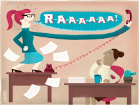
Hunter did a series of illustrations for The Guardian that are like a step to step on how to behave when at work, each title beginning with ‘How to....’. These are not actually seen as the politically correct way to behave but are seen more as comical versions. The use of the drawn characters adds to the light heartedness of the context.


My favourite work is Hunters lettering which is beautifully decorative and colourful. She uses mixed media which adds to the playful theme throughout her work. Her font is also included in tourist maps for publication such as Los Angeles Magazine. These are not typical route maps but instead use little illustrations and curvy dashed lines for a more friendly approach.

44 Flavours

http://www.44flavours.com/

Sebastian Bagge and Julio Rolle both studied Graphic Design and started to work together, eventually launching 44 Flavours Magazine in 2003. 44 Flavours focus on graphic design and organising art shows as well as publishing the magazine. The magazine includes graphic artworks, photography and music from all over the world. The main influences of the designers behind 44 Flavours are graffiti and street culture. 44 Flavours’ interests range from the BMX and skateboard scene to typography and graphic design. All these influences combined are used to create colourful and passionate designs that are featured on skateboards, magazine, record sleeves, etc.

Like Naja Conrad-Hansen, 44 Flavours have used their own style of illustration and print that is then featured on clothing and magazines. Although their influences are different their style of using different materials to create illustrative images shows similarities.

44 Flavours have also done work for the fashion label Flowerdrum. The femininity in the flat, coloured shapes shows similarity to Conrad-Hansen’s work.


The work for clothing brand Top Dollar is a set of texts made up of the same or individual illustrative letters in various colours. On one of the images each letter has its own colour, pattern, and background. These are then featured on T-shirts for the brand. This has a really fun feel to it and the influence of graffiti really shows.


Most of the font used in 44 Flavours’ work looks as if drawn freehand and many of the letters in one set text are different like in Top Dollar. This influence of street culture is featured in all of their work giving them an urban edgy style.

Naja Conrad-Hansen

http://www.meannorth.com/Naja_conrad-hansen.htm

Naja Conrad-Hanson is a designer and artist whose practice includes illustration, painting, graphic design and much more. She also designs print and pattern for clothing labels including her own brand Meannorth. Like Jayne Helliwell, Conrad-Hanson is hands on with her work and also uses dialogue in some pieces. In some ways Conrad-Hanson is more extreme in her illustrations, more colour, etc, and her influences stem mainly from fashion. However, she is also influenced from hardcore music and general observing the world around her similar to Helliwell in her works for music based clients and Oxfam. Conrad-Hansen’s work has appeared in fashion/graphic magazines and books and she has also worked on projects such as clothing brand Max Mara and a children’s book.


One piece of work that I feel is similar to Helliwell’s piece ‘Idturts’ is the work below. Both images give off a surreal dark feel and look as if collaged with photo and illustration. Conrad-Hansen’s piece has more illustrative depth with more going on visually in the image but both of them work well as an image with a written statement.


The illustrations printed on clothing are my favourite and I would love to have them in my wardrobe. Hansen also does textile pieces, which show she is a skilled hands on designer. It is clear by looking at her work that she concentrates a lot on feminine beauty and figures. Each illustration has great depth when looking up close, such as almost hidden shapes, colours and text. All works range from masses of bright colour and different used media to just black and white, each as exciting as the next.

Jayne Helliwell

http://www.jaynehelliwell.com

Jayne Helliwell is a freelance designer who works in design & direction, illustration and video. The reason I chose her as my link to MM is that she too illustrative with her work and also includes typography to her images. There are certain works I feel are similar to some of MM’s posters.

The project ‘Explore’ for the client Lark is similar to MM’s ‘Alphabet’, however Helliwell seems to have cut out and put together images and the photography does not include iconic fashion figures but more general figures and faces. I don’t know the reasons for this but my guess is the she is suggesting the exploration of different body parts and elements combined in unusual ways.


There is a beautiful flowing font reoccurring in Helliwell’s work that is sometimes used with other images or just typeset on its own as an image it’s self. It reminds me of natural and organic forms which fits perfectly with the images of faces and natural body forms in some of her works. This is also similar to the typography used in MM’s ‘Witness Screen’ poster in the series ‘No ghost just a shell.'


The Dazed Digital website has a playlist every month and different artists are commissioned to create an image for this playlist. Helliwell has been one of these designers for the June 2008 list. She has done this combining photography and her flowing font. I understand why she has used the cassette tape as it is to signify music but I’m not sure why she has used the imagery of snowy mountains, maybe it is to do with the music genre.


Helliwell has also worked for Oxfam and a lot of her clients are music involved.

MM Paris

http://mmparis.com/mm_posters.pdf

MM Paris create amazing images using a mixture of media includ

ing typography, photography and illustration. Their posters range from black and white with a little colour to posters with a variety of bright colours. The works are chaotic, but in the right way that they look expressive and full of passion. I love how they do not stick to just one style but instead have a more broad approach to their work. When talking about their work they explain that the client is a main factor of each work and should it reflect their personality which shows as each piece is individual, e.g. *“You could say that that person's individuality influences us”. The typography used is creative and imaginative and the use of photography and illustration works well combined.

*http://www.mmparis.com/texts/mm_shimizu.html

MM Paris has worked with Bjork in her video *‘Hidden Place’. I like the use of colour of the liquid like movement that passes through the openings of Bjork’s face, i.e. eyes, nose, etc. I also like how the camera moves with the movement suggesting that it is moving around inside her head when u can’t actually see it. This tells me that this is the hidden place. However, for me it is too repetitive and although it does change slightly I feel that the direction, colour and size changing more could alter this.

One of my favourite works is the ‘Alphabet’ followed by the ‘Alphamen’, black and white fashion photography cut out into glyphs to form the alphabet. Each letter works well as a fashion image on its own as well as part of an alphabet. Particularly the letters in ‘Alphamen’ they remind me of something on a clothing or aftershave poster advertisement.


The ‘Balenciaga’ posters also use photography but close-ups of women’s faces. By working over the top with more photos and illustration they add depth and intrigue as to why this has been done. Is it to reflect the thoughts or representation of the women or just to make them more visually pleasing or interesting?


A lot of the type used in MM’s posters is extremely decorative and fun whilst remaining high quality and legible in most cases.